Lumen Player
A cinematic interface built for remote-first navigation.
Role: Senior Product Designer
Platform: Roku, Android
Team: Product Manager, 2 Engineers, QA
Responsibilities: Product strategy, UX architecture, interaction design, UI design, prototyping, usability testing

The Challenge
Smart TV interfaces often inherit patterns from mobile and desktop products.
However, television experiences operate under entirely different constraints
- Users sit 3–4 meters away from the screen
- Interaction happens through directional remotes
- Users expect instant content discovery
Many existing TV interfaces create friction because:
- Navigation requires too many clicks
- Content information is hidden behind multiple screens
- Remote interactions feel unintuitive
The Goal
Design a TV-first streaming interface that makes browsing content effortless while keeping the experience cinematic and immersive.
The product needed to support three key behaviors
1. Browsing live TV channels
2. Discovering shows, movies etc.
3. OTT streaming service functionality like: Netflix, HBO, Disney...
Success metrics included
- Faster time to content
- Higher session engagement
- Improved navigation clarity
Understanding the TV Context
Designing for TV requires a fundamentally different UX approach compared to mobile or desktop.
Unlike touch interfaces, TV interaction relies on focus states.
Focus-Based Navigation
- Current focus
- Navigation direction
10-Foot Readability
- Larger typography
- High contrast
- Simplified layouts
Visual Content Discovery
On television, users primarily discover content through visual browsing rather than search.
Large artwork and cinematic layouts were prioritized to support this behavior.
Product Architecture
The product experience was structured into four primary areas:
1. Live TV Guide
Schedule-based browsing for live programming.
2. Channel Navigation
Quick switching between available networks.
3. On-Demand Discovery
Browsing movies and series.
4. Video Playback
Minimal and distraction-free controls.
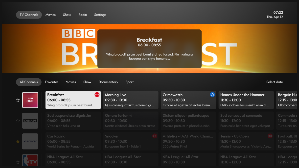
Designing the TV Guide
Timeline-Based Layout
Programs are displayed across a horizontal timeline so users can easily scan upcoming shows.
Channel Anchoring
Channels remain fixed on the left side of the layout, making navigation predictable.
Contextual Program Details
When a program receives focus, additional information appears in a floating preview card without forcing users to open another screen.
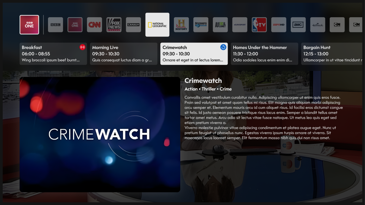
Channel Browsing
Users frequently navigate TV by switching channels.
To support this behavior, the design introduces a horizontal channel carousel with recognizable network logos.
Benefits
- Faster recognition compared to text lists
- Familiar interaction model
- Reduced cognitive load
Selected channels scale slightly larger to provide clear focus feedback.
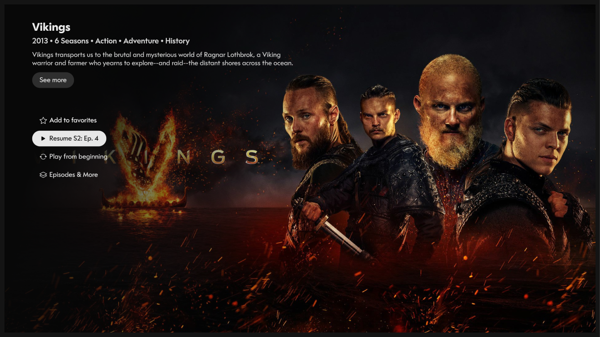
Content Discovery
For movies and series, the experience shifts to a visual-first browsing approach.
Large cinematic banners showcase featured content.
The design prioritizes
- Strong visual storytelling
- Minimal text clutter
- Quick access to playback
Show Detail Experience
- Key artwork
- Genre and metadata
- Description
- Primary actions
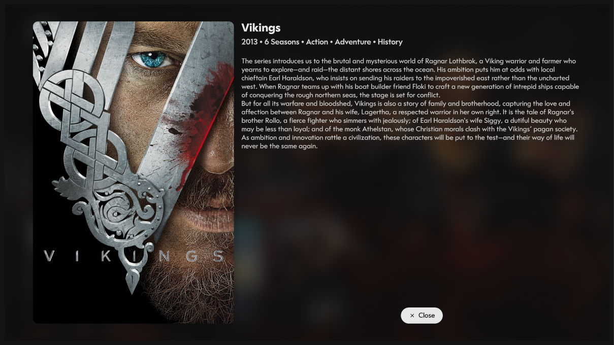
Episode and Content Details
- Poster artwork
- Show branding
- Detailed description
- Episode and season information
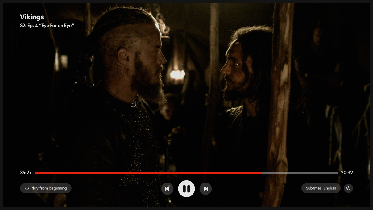
Video Playback Design
- Large central playback controls
- Clear progress tracking
- Quick restart functionality
Usability Testing
We conducted usability testing with participants familiar with streaming platforms.
Participants were asked to complete tasks such as:
- Finding a live TV program
- Resuming a previously watched show
- Browsing for a new series
Insights
Users preferred visual browsing over menu-based navigation, reinforcing the decision to emphasize large artwork.
Results
After iterations and usability improvements, the design achieved measurable improvements:
- 40% faster content discovery
- Participants located desired content significantly faster
- Improved navigation confidence
- Users reported the interface felt more predictable with remote controls